CASE STUDY
What is Ikafox?
Ikafox is a web application that helps web designers make website without having to learn code. In other words, Ikafox is comparable to Wordpress in the web design application domain. In our present economy, it offers a more secure platform and in Dutch language, targeting Web designers in the Netherlands.
My ultimate goal in this project was to make the brand more recognizable among all web design services. Web designers would be able to recognize the web application when they see the logo.
My branding process started with visual positioning based on the information we obtained from the client. Once I discussed my vision with their team, we decided to start our work from scratch, despite the fact that the Ikabus already had a logo for their web application before the lauch.
Nowadays, more and more companies are leaning toward simplification, clarity, and modernism, so it was pretty clear to us why the Ikabus team decided to lean in that direction.
Nowadays, more and more companies are leaning toward simplification, clarity, and modernism, so it was pretty clear to us why the Ikabus team decided to lean in that direction.
Flat, simple, and clean logos are now everywhere. That trend is still growing. Good visual identity should give the brand a marketing advantage.

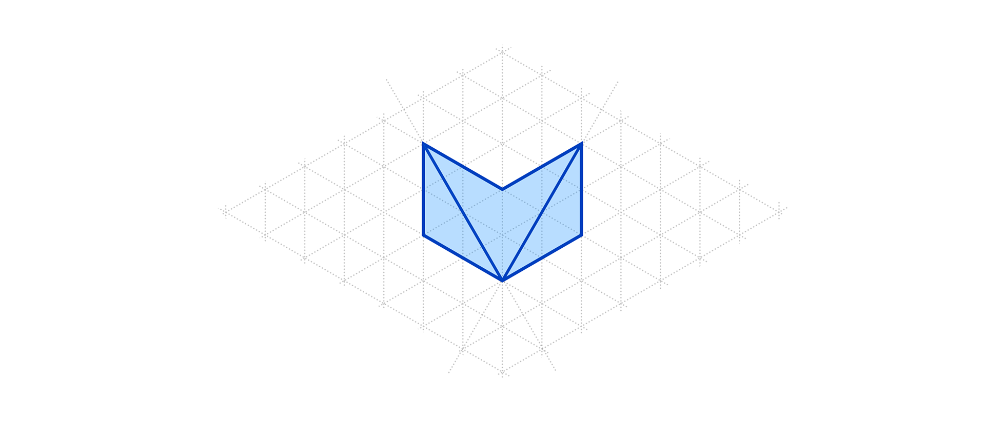
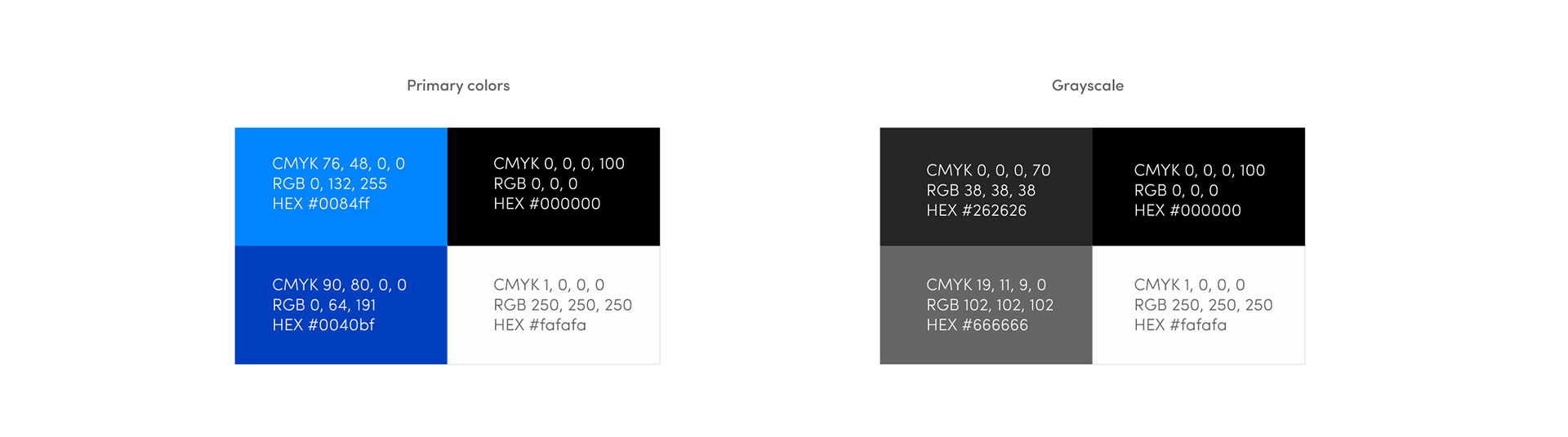
Once I identified the right shape for Ikafox logo design, I started exploring color combinations. To preserve the adeptness from the main logo and highlight some "tech-coolness", I chose a few blue tones.
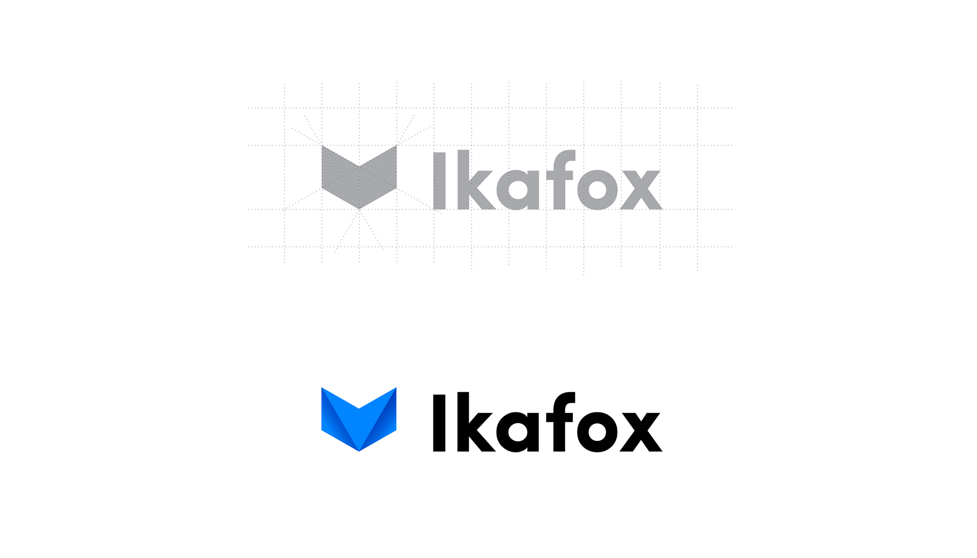
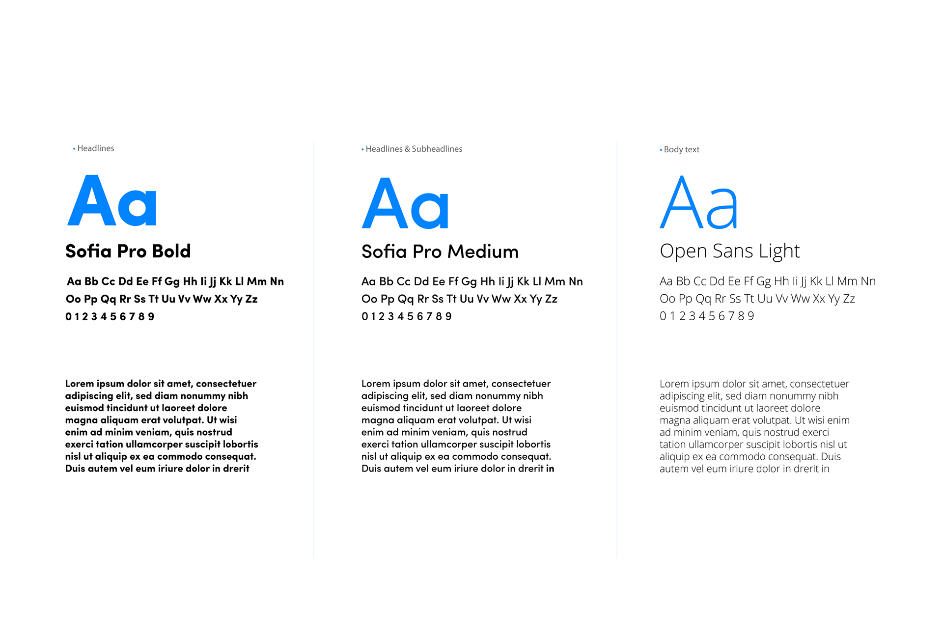
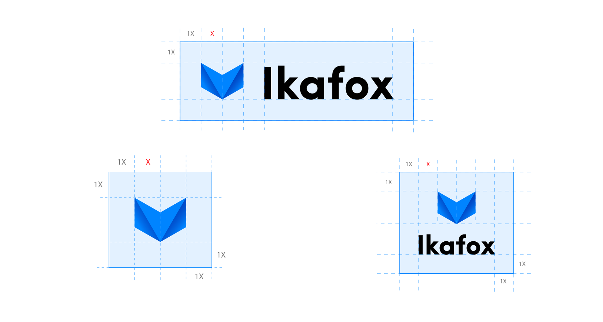
The sharp and modern logo sign I've designed for Ikafox requires sharp wordmark. Ikafox needed a SansSerif wordmark, however, it took time to find the right font weight, balanced spacing, and unique branded elements such as the fox.

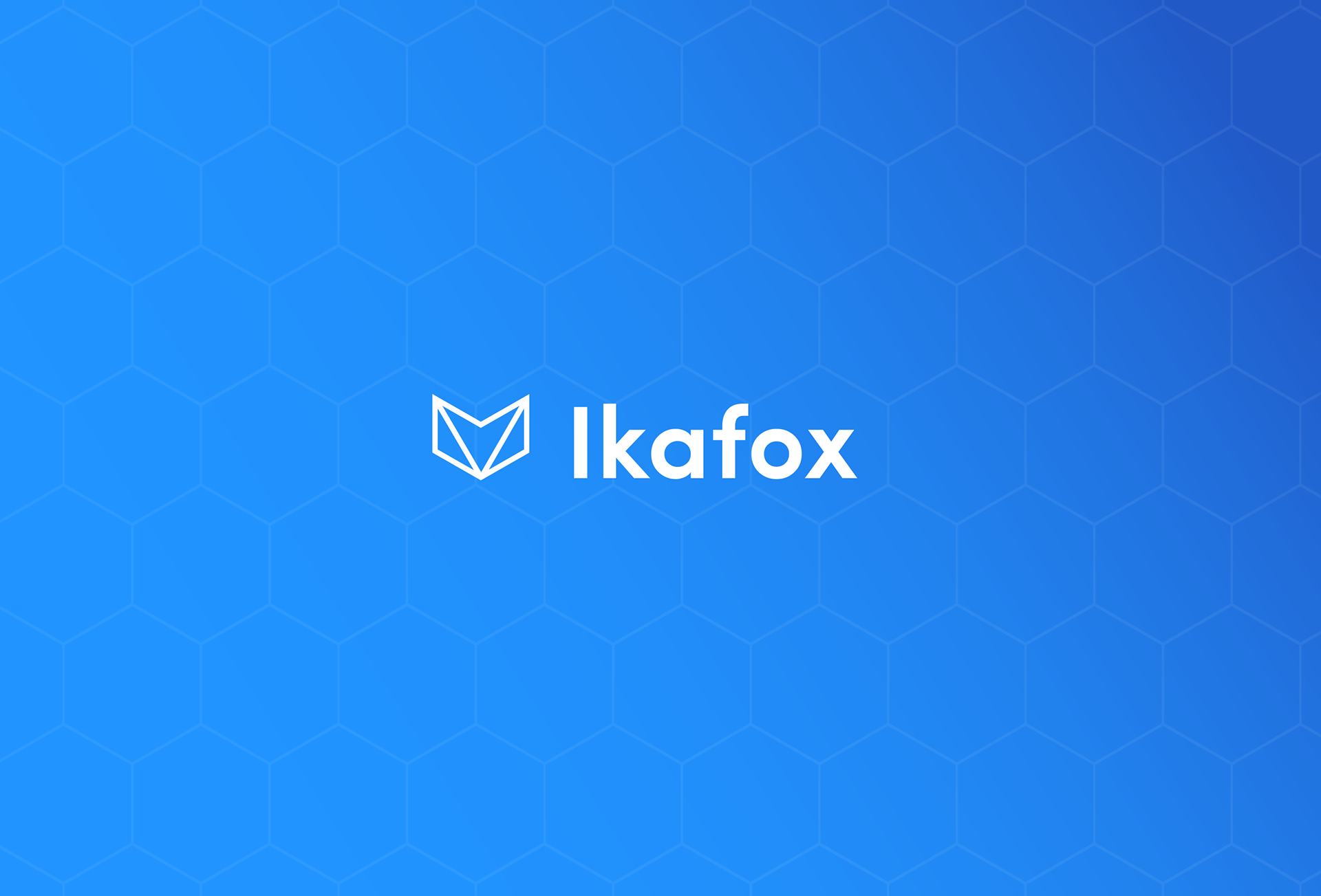
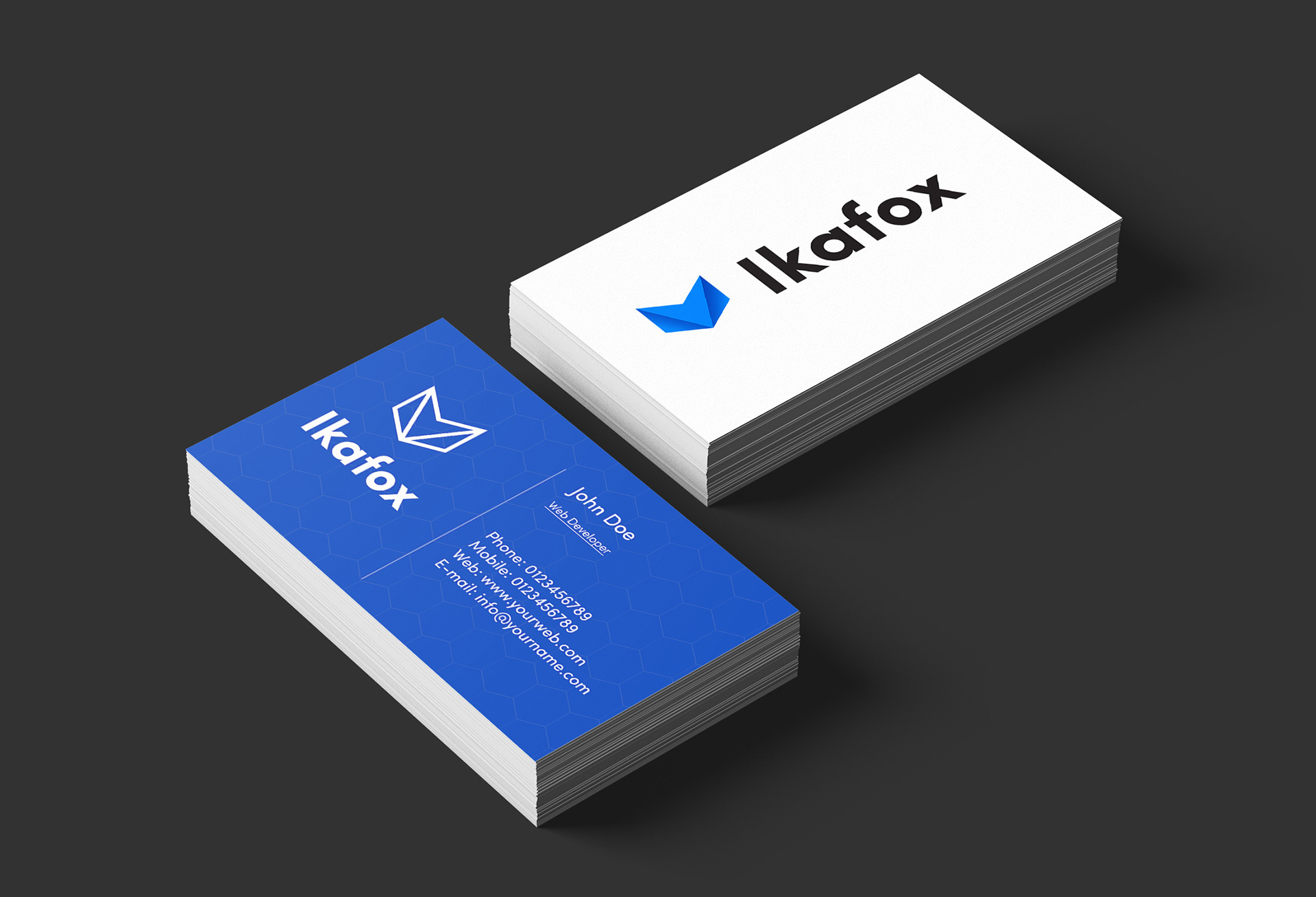
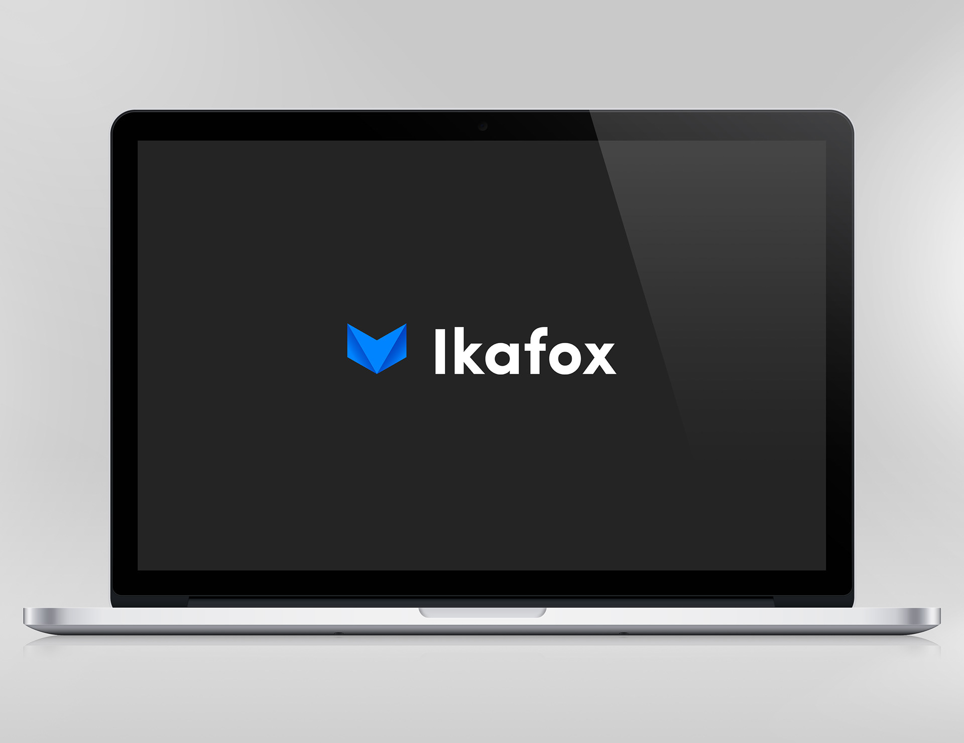
The following is the final result delivered to the Ikafox team. It has lead to very positive feedback from the team and its clients, as well as measurable increased brand awareness.

THANK YOU FOR WATCHING